This graph from the blog Innocent Bystanders, gives us a good look at reality versus O’s projections regarding reality. In this case, they have demonstrated the truth behind the dreams Obama keeps projecting onto our economy.
The graph is going viral so I thought we ought to do our part in sending it on its way.
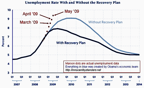
The writer, Geoff, says this is a corrected version of an earlier chart:
– – – – – – – – –
I’ve also added more points to show the monthly data since Oct ‘08. The Obama team’s graph was plotted by quarters instead of months, so the numbers don’t quite line up.
Sorry for the mistake. At least nobody can claim that I was coming down too hard on Obama’s economic team.
Please do me a favor and spread the word that the corrected graph is available [done! – D]
[FUN UPDATE: On May 11th, Christina Romer (she who made the original chart) said that unemployment could get as high as 9.5%. Any bets on whether she’s right?]
Well, given that the Baron got his pink slip right on that tippity top red dot, I’m betting with her. It’s over 10% in California now. Hard times have come again for sure, despite the politicians’ claims. The only guarantee we have is that whatever problem we face, government “help” will only make it unfixable. In fact, government is only good for creating messes (see Fannie Mae and Freddie Mac and the Fed), not cleaning them up.
By the way, Innocent Bystanders is an interesting blog in a fey sort of way. His byline reads:
Anyone can blog ~ Commenting is Hard
But y’all already knew that.
They have some tips for cutting costs in these trying times. The link is provided as a public service to our readers.
Other dreams and realities include the multicultural, tolerant, and enlightened Islam, as promoted in the Balkans by the Western inter-Nazi NATO scum: Bosnian Croats Moving to Republic of Srpska because Sarajevo Turning into European Tehran.
The is no curse that is vile enough to convey my disgust.
No worries about the unemployment. Mr. Bernanke will print enough money to provide everyone with sufficient unemployment benefits, forever.
Are you happy now, citizen?
Good, for happiness is mandatory.